Modus themes: review of select "faint" colours
UPDATE 2021-01-19 14:21 +0200: The color-tools.el is now called
ct.el.
The Modus themes come with a customisation option to tweak the looks of
programming modes (there are lots of customisation options—consult the
official manual):
modus-themes-syntax 'faint. The present entry documents the
refinements that were introduced to a subset of those “faint” colours.
In this report I am making use of the new ct.el library,
developed by Github user neeasade. Even though it is not available in
any package archive as of this writing, I highly recommend it to every
Emacs user who has an interest in colour and/or who is a theme designer.
Consider it as a complement to the built-in color.el Emacs library
(check the source code with M-x find-library and then insert color).
What it offers compared to the built-in option is an element of
convenience, as it lets us use the colour space of our choice. In my
case that is RGB while the notation is hexadecimal.
Colour enthusiasts are also encouraged to read neeasade’s essay: Reasoning about colors.
The color-tools function that introduces a new test to my workflow is
ct-name-distance, which applies the CIE ΔE 2000 formula. For the
purposes of this article, I am also applying ct-contrast-ratio, even
though there exists modus-themes-contrast as part of my themes, which
builds on the same WCAG formula for contrast in relative luminance
between two values (implemented in modus-themes-wcag-formula).
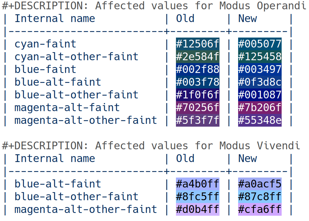
Old and new values for “faint” blues and magentas
The tables below merely present the affected variables and the change in
values assigned to them. The overall intent is to slightly increase the
saturation of those colours while accounting for differences between
them in lieu of their intended purpose, which is to highlight code in a
more subtle way than the default aesthetic of the themes—read the doc
string of modus-themes-syntax.
cyan-faint and cyan-alt-other-faint for Modus Operandi have also
been corrected for hueness, mainly by reducing their red light channel.
Other changes are more subtle.
#+DESCRIPTION: Affected values for Modus Operandi
| Internal name           | Old     | New     |
|-------------------------+---------+---------|
| cyan-faint              | #12506f | #005077 |
| cyan-alt-other-faint    | #2e584f | #125458 |
| blue-faint              | #002f88 | #003497 |
| blue-alt-faint          | #003f78 | #0f3d8c |
| blue-alt-other-faint    | #1f0f6f | #001087 |
| magenta-alt-faint       | #70256f | #7b206f |
| magenta-alt-other-faint | #5f3f7f | #55348e |

#+DESCRIPTION: Affected values for Modus Vivendi
| Internal name           | Old     | New     |
|-------------------------+---------+---------|
| blue-alt-faint          | #a4b0ff | #a0acf5 |
| blue-alt-other-faint    | #8fc5ff | #87c8ff |
| magenta-alt-other-faint | #d0b4ff | #cfa6ff |
Here is a picture of the same table with M-x rainbow-mode enabled, so
if it does not look clear please open it in another window:
Notice the fine tweaks (yes, those are the lengths we go to).
Harmonising colour distance for Modus Operandi
The following table only concerns Modus Operandi (we employ another technique for Modus Vivendi—next section). It measures the distance of the new values relative to black and white (CIE ΔE 2000). A value of 100 is the maximum and it would mean in practical terms that the closer our values are to the maximum, the more they appear as variants of black for our light theme.
The table must thus be read as an attempt to slightly “brighten up”
those values and/or normalise the distance between some of them. As
such compare columns 2 to 4 and 3 to 6 (all tables are in org-mode
notation).
#+DESCRIPTION: Modus Operandi cie-DE2000 distance for faint blues and magentas
| old     | #ffffff | #000000 | new     | #ffffff | #000000 |
|---------+---------+---------+---------+---------+---------|
| #12506f |      58 |      27 | #005077 |      58 |      28 |
| #2e584f |      55 |      28 | #125458 |      58 |      27 |
| #002f88 |      71 |      29 | #003497 |      68 |      31 |
| #003f78 |      65 |      27 | #0f3d8c |      65 |      30 |
| #1f0f6f |      83 |      28 | #001087 |      81 |      30 |
| #70256f |      64 |      31 | #7b206f |      62 |      32 |
| #5f3f7f |      59 |      32 | #55348e |      63 |      32 |
#+TBLFM: $2='(ct-name-distance $1 @1$2);%0.0f :: $3='(ct-name-distance $1 @1$3);%0.0f :: $5='(ct-name-distance $4 @1$5);%0.0f :: $6='(ct-name-distance $4 @1$6);%0.0f
[ does anyone know of a more succinct #+TBLFM expression? ]
An interesting observation to make with regard to the innate properties
of the channels of light, is how #001087 and its old #1f0f6f
(blue-alt-other-faint) is perceived as being closer to black while
compared to pure white, even though it is impressed in more-or-less the
same way as the other colours when compared to pure black (the
discrepancies in the values shown on row 6, relative to the other rows).
This is because the blue channel, here represented as pure blue
(#0000ff), is the darkest among the three components of the RGB
triplet that we are using (green is the brightest, red is medium (though
not precisely)).
Color distance between the values of Modus Vivendi
While we tested our colours against black and white for Modus Operandi, that technique was not suitable for Modus Vivendi. This is because a dark theme has different requirements and the reason is that the human eye is more attuned to spot differences in colour against a dark backdrop (and colour is, in essence, an expression of light, while the pure black main background of Modus Vivendi is meant to represent the absence of light—notwithstanding screen technology that always uses light even for black).
As such, we are mostly interested in adjusting the distance between the colour values that were deemed somewhat problematic (always in relative terms, as those tweaks are virtually not discernible by the untrained observer).
#+DESCRIPTION: Modus Vivendi cie-DE2000 distance OLD
|         |         | Distance |
|---------+---------+----------|
| #a4b0ff | #8fc5ff |  10.2885 |
| #8fc5ff | #d0b4ff |  19.9316 |
| #d0b4ff | #a4b0ff |  10.5743 |
#+TBLFM: $3='(ct-name-distance $1 $2);%0.4f

#+DESCRIPTION: Modus Vivendi cie-DE2000 distance NEW
|         |         | Distance |
|---------+---------+----------|
| #a0acf5 | #87c8ff |  13.2249 |
| #87c8ff | #cfa6ff |  24.2411 |
| #cfa6ff | #a0acf5 |  11.7710 |
#+TBLFM: $3='(ct-name-distance $1 $2);%0.4f
Contrast compared to the main (and relevant) background values
For the sake of completeness, the following tables confirm that the new values are consistent with the overarching design principle of the themes for a minimum contrast in relative luminance between background and foreground of 7:1 or higher.
#+DESCRIPTION: Modus Operandi WCAG contrast for select "faint" colours
|         | #ffffff | #f8f8f8 | #f0f0f0 |
|---------+---------+---------+---------|
| #005077 |    8.70 |    8.19 |    7.63 |
| #125458 |    8.63 |    8.12 |    7.57 |
| #003497 |   10.84 |   10.20 |    9.51 |
| #0f3d8c |   10.16 |    9.57 |    8.92 |
| #001087 |   14.75 |   13.89 |   12.94 |
| #7b206f |    9.22 |    8.68 |    8.09 |
| #55348e |    9.26 |    8.72 |    8.12 |
#+TBLFM: $2='(ct-contrast-ratio $1 @1$2);%0.2f :: $3='(ct-contrast-ratio $1 @1$3);%0.2f :: $4='(ct-contrast-ratio $1 @1$4);%0.2f

#+DESCRIPTION: Modus Vivendi WCAG contrast for select "faint" colours
|         | #000000 | #110b11 | #181a20 |
|---------+---------+---------+---------|
| #a0acf5 |    9.71 |    9.00 |    8.05 |
| #87c8ff |   11.74 |   10.87 |    9.72 |
| #cfa6ff |   10.55 |    9.77 |    8.74 |
#+TBLFM: $2='(ct-contrast-ratio $1 @1$2);%0.2f :: $3='(ct-contrast-ratio $1 @1$3);%0.2f :: $4='(ct-contrast-ratio $1 @1$4);%0.2f
As has been noted before, such as in the recent review of the faces that pertain to the rainbow-delimiters package, there are a lot of considerations to be made when designing a theme. My opinion is that this endeavour stands at the intersection of art and science. We employ scientific insight in support of our choices, while we exercise artistic judgement or freedom in interpreting the propriety of every result in its particular context. And we do so in a non-dogmatic way, meaning that we are prepared at all times to review our work and challenge our assumptions.
Consequently and despite the fact that we remain committed to the minimum 7:1 contrast ratio, we cannot tolerate some inadequate technique of procedurally picking colours which conform with a target of that sort, nor can we confine ourselves to arbitrary constraints such as relying only on 4, 8, 16 colours or whatnot. Constraints need be conducive to the primary design objectives and must thus remain subject to continuous interpretation and evaluation, in order to stay in sync with the evolving requirements of the project.
It is the designer who sets the constraints and delineates the boundaries of their artistic discretion, so that there necessarily exists an element of auto-nomy (self-determination) as opposed to hetero-nomy (determined by an other [source]), pursuant to the tenets of the project. The minimum contrast ratio is inviolable, yet there is wide range of scenaria that remains to be tested and carefully examined even after accounting for that principle.